Swiss Minimal look for PowerPoint
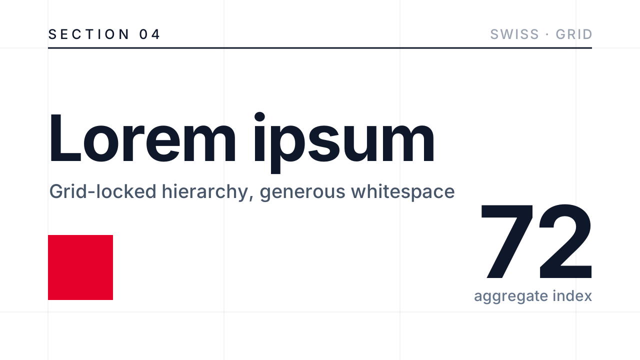
A strict Swiss grid: modular layout, sharp hierarchy, generous white space and almost no decoration. The most restrained look, where typography and alignment do the work.
- Board papers and investment cases
- Consulting and strategy decks
- Architecture and design firms
Decks made in this look
Real decks from the gallery. Open one to see every slide or download the .pptx.
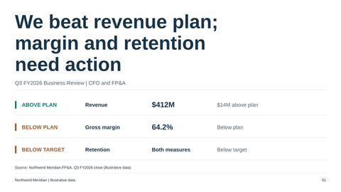 Quarterly business review: performance, drivers and decisions
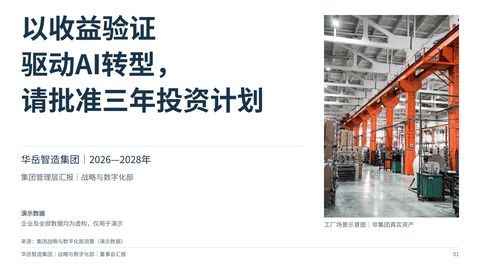 Group AI transformation: a three-year investment plan for the board
Questions
When is Swiss Minimal the right choice?
When the content is strong and the audience is senior: board papers, investment cases, consulting recommendations, architecture and design firms. It is the wrong choice when you need warmth or energy, such as a school lesson or a festival recap; try Soft Rounded or Memphis there.
How do charts and tables look in Swiss Minimal?
Flat and exact: native PowerPoint charts on a near-white field, one strong colour used as punctuation, no shadows and no gradients. Tables use thin rules and plenty of space.
Does Swiss Minimal use pictures?
Rarely. Type and alignment do the work; a photo or illustration appears only where it carries real information.
Is the deck editable?
Yes. Every slide is native PowerPoint: text boxes, shapes, charts with Edit Data and tables. The look is colours, fonts and layout, so you can change any of it.
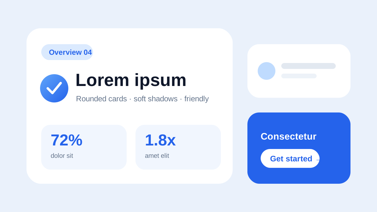 Soft Rounded
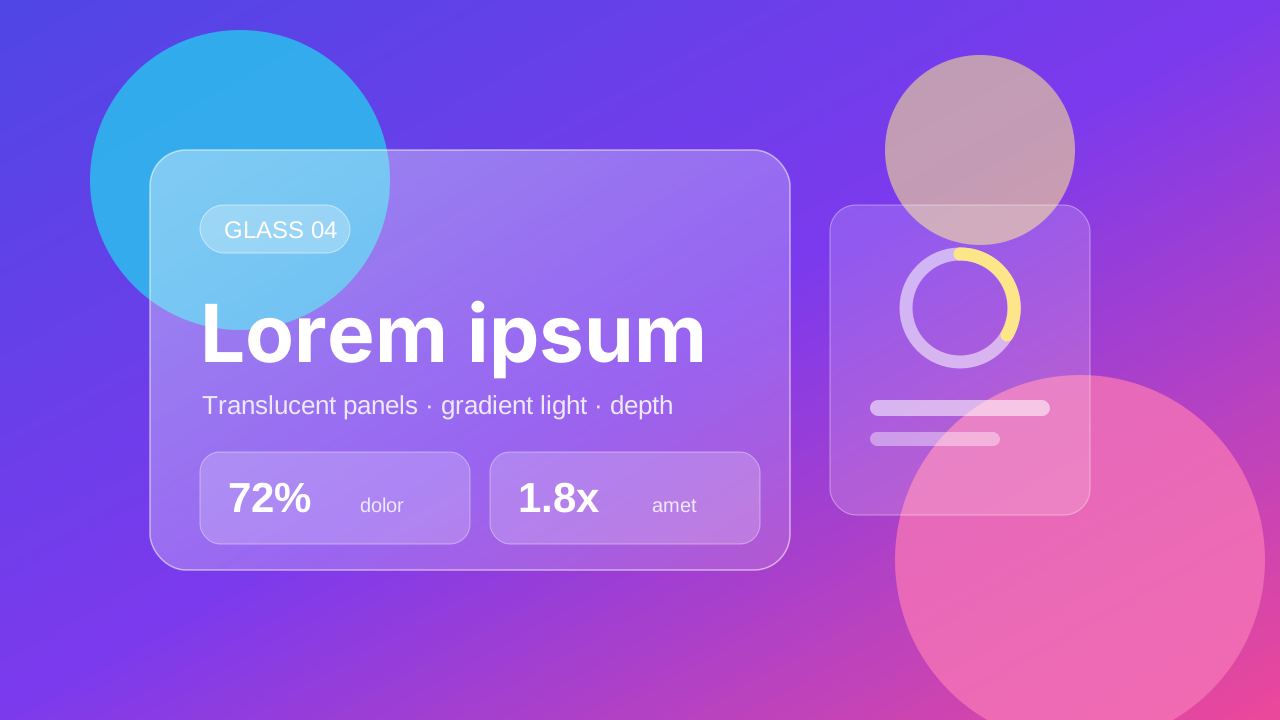 Glassmorphism
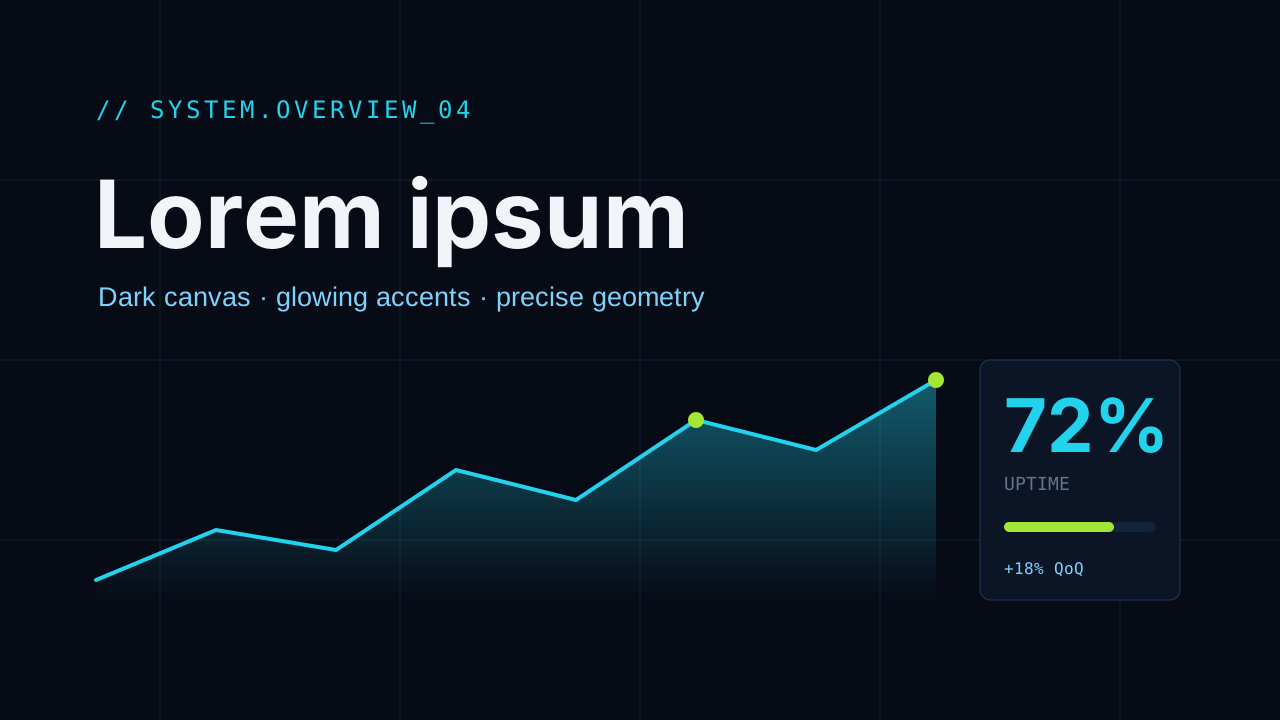 Dark Tech
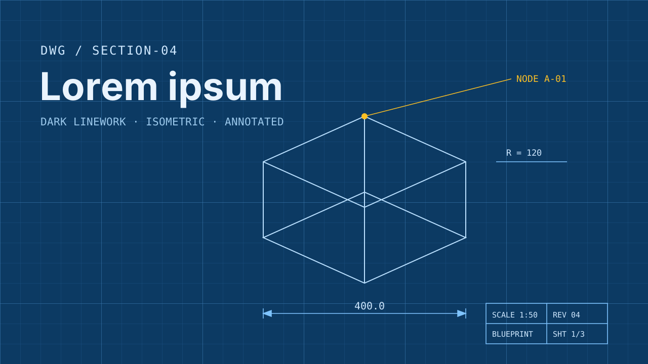 Blueprint
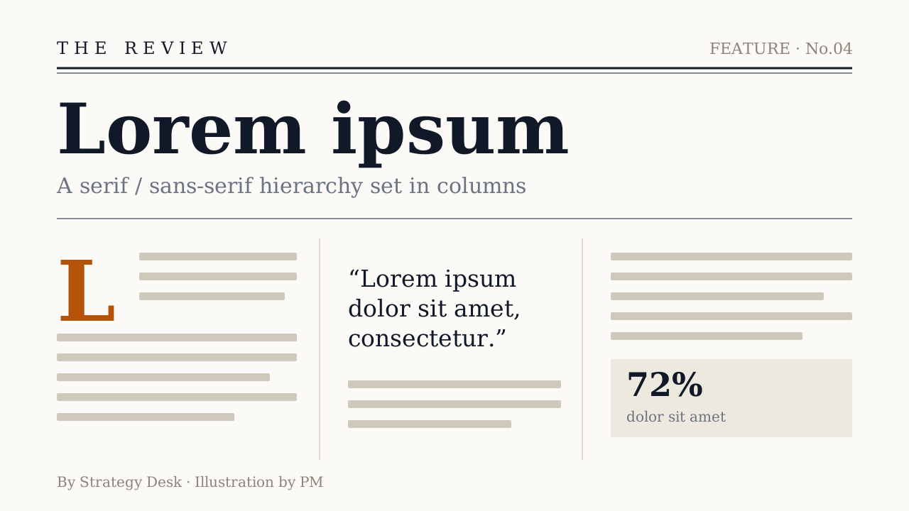 Editorial
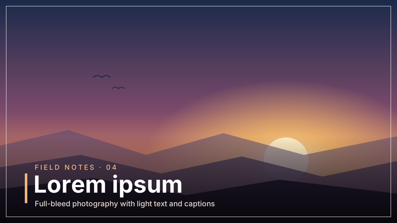 Photo Editorial
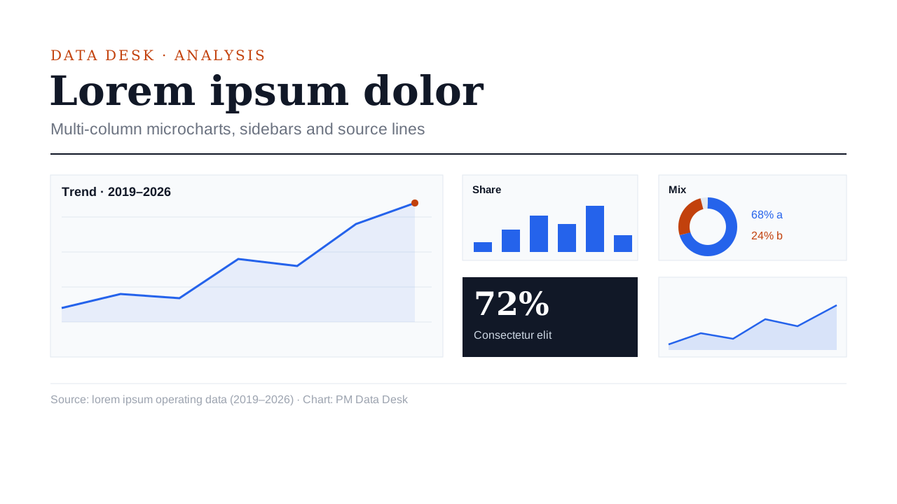 Data Journalism
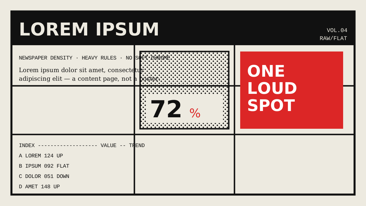 Brutalist
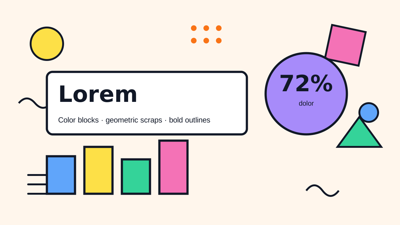 Memphis
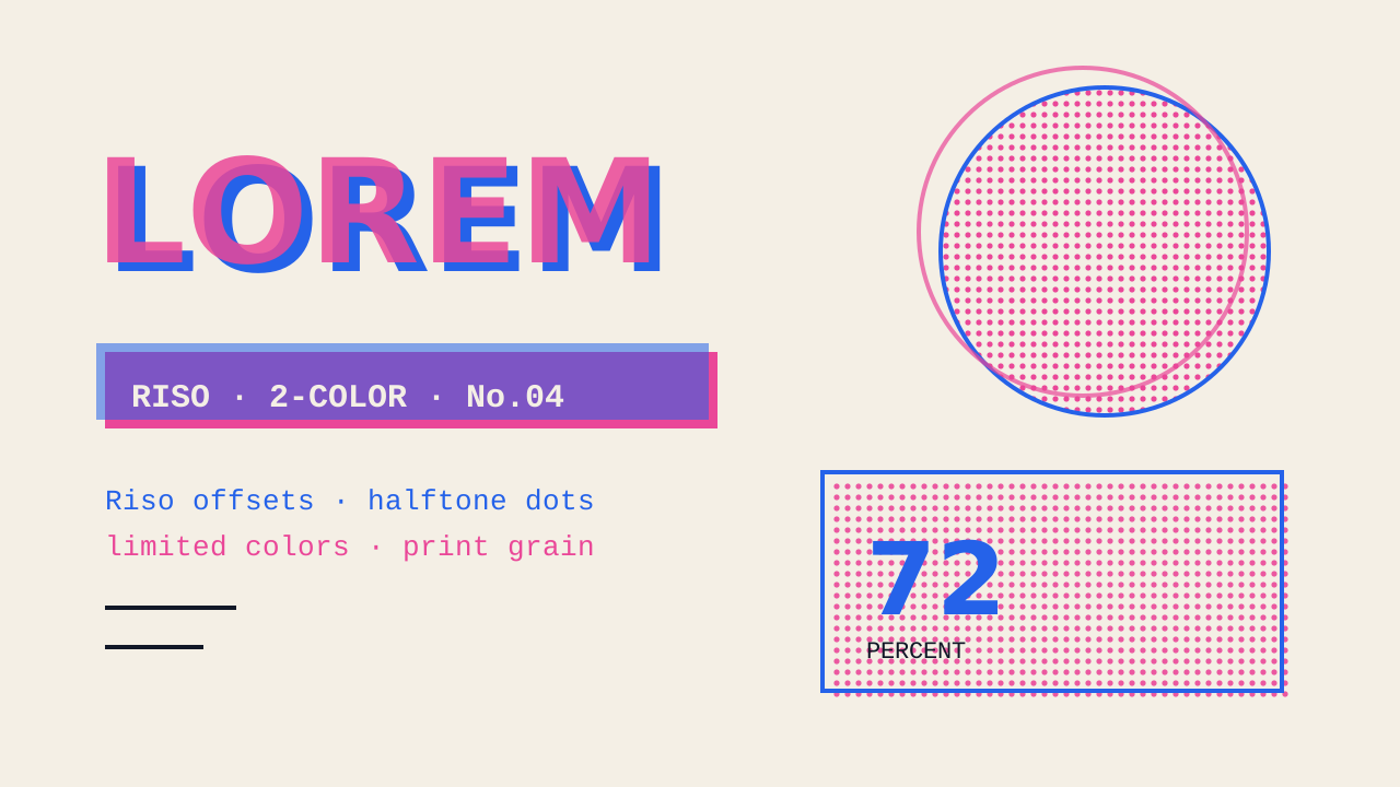 Zine
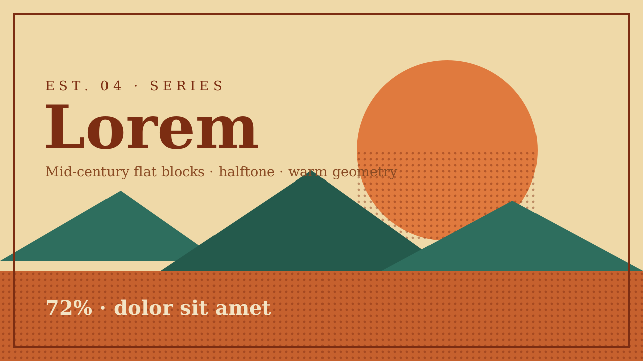 Vintage Poster
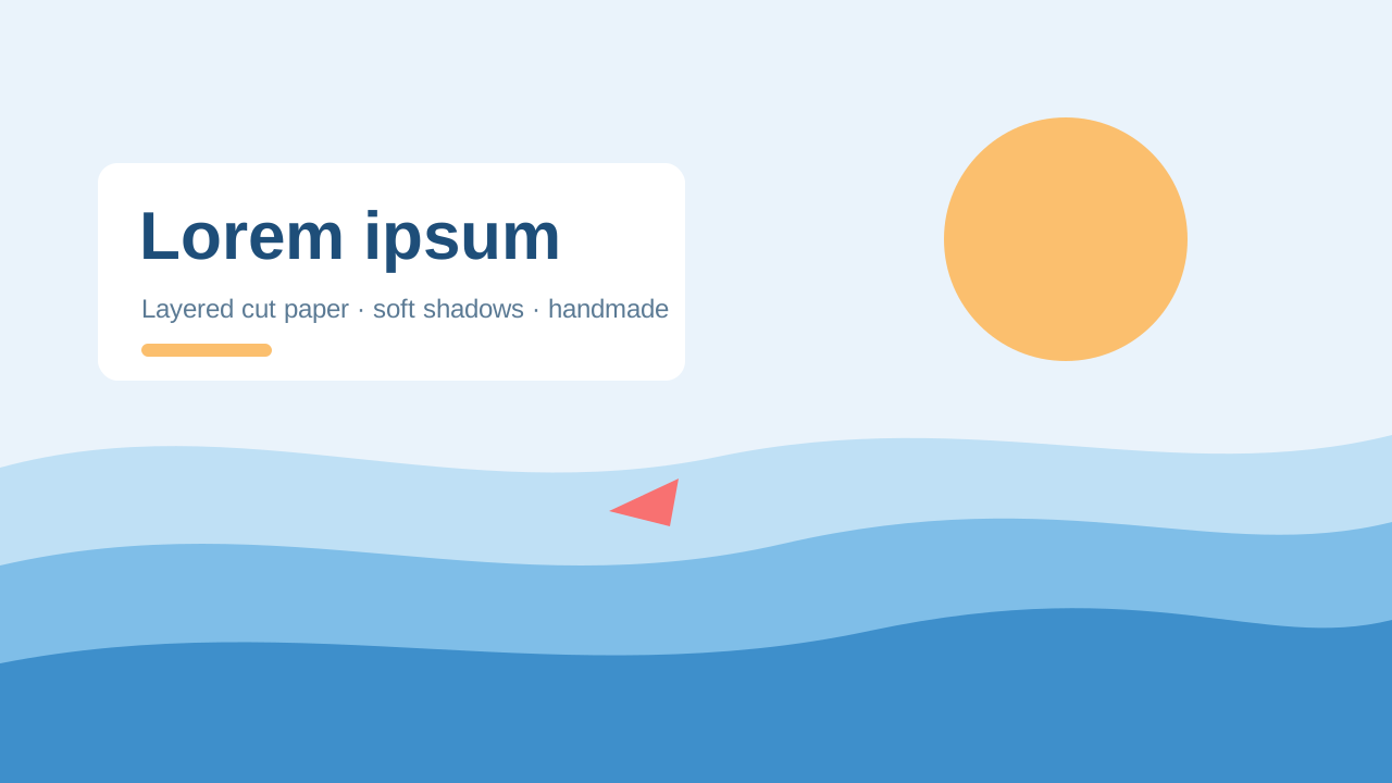 Paper Cut
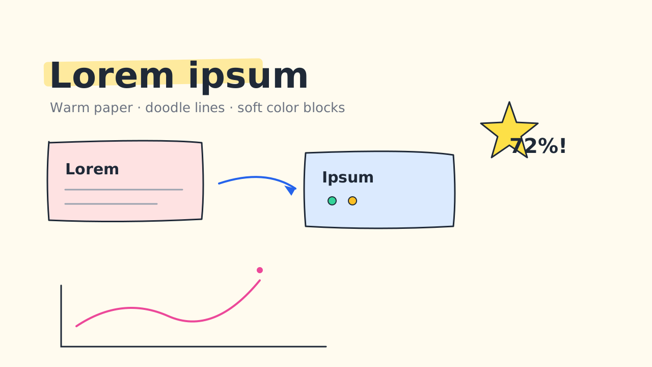 Sketch Notes
 Ink Notes
 Chalkboard
 Ink Wash
 Pixel Art
Make your next deck in minutes, then make it yours.
Start with 20 free credits. No card needed.
Make a deck in this look